Think you know your logos? From the golden arches to the Golden State Warriors, a great logo becomes recognisable as the face of brilliant brands.
When it comes to some of the most famous and well-known logos, there are often things going on behind the scenes that even the savviest person overlooks.
Whether it’s a hidden meaning buried deep within the logos shape or a subtle change that goes unnoticed. Logos are far more complex than you may believe.
The biggest businesses are constantly looking at ways to grow their following and build a connection with more potential clients. If that means a little brand freshen up, go for it! But, make each decision strategically and fearlessly; your brand speaks for you as you speak for your brand.
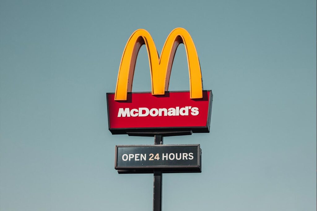 1. McDonald’s
The golden arches of the McDonald’s logo were used to symbolise the arches that formed part of the architecture of their original store. They were later introduced to the logo full time and scaled up because it was believed you could see the arches from war and wide.
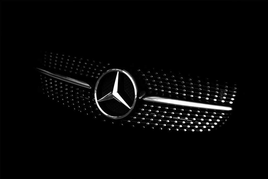 2. Mercedes Benz
Some logos are so recognisable that they don’t need to be accompanied by the company’s name. Mercedes Benz is one of those logos! Did you know that the tri-star logo represents the company’s dominance over land, air and sea? Well, now you do!
 3. Starbucks
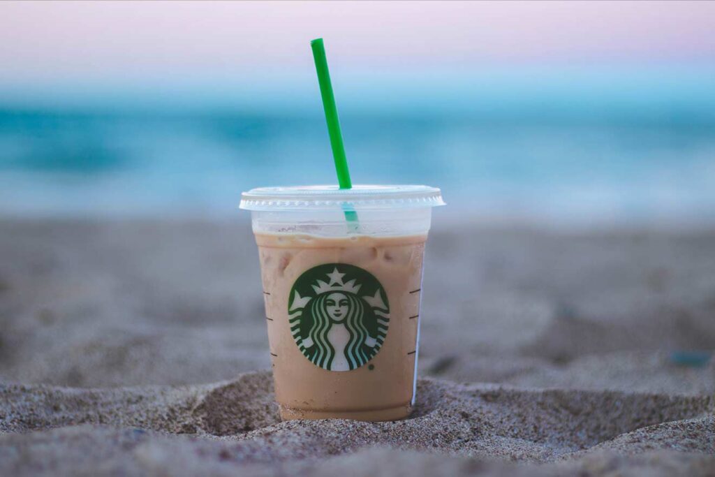
The world’s most recognisable coffee house is known by its logo alone. The siren who guides us to their stores for delicious coffee and confectionaries is shown without the Starbucks name, highlighting the power of doing something outside the box.
 4. FedEx
Here’s one of our favourites, maybe because growing up a budding designer, you are exposed to this logo countless times as a perfect example of simplistic, well thought out imagery. What’s not to love about the FedEx logo? Simple font, contrasting colours and a hidden surprise that once you’ve seen, you can’t unsee.
Take a quick look in the space between the ‘E’ and the ‘X’ you’ll find a brilliant negative space arrow. The FedEx logo really is a shining example of fantastic logo design.
 5. Nike
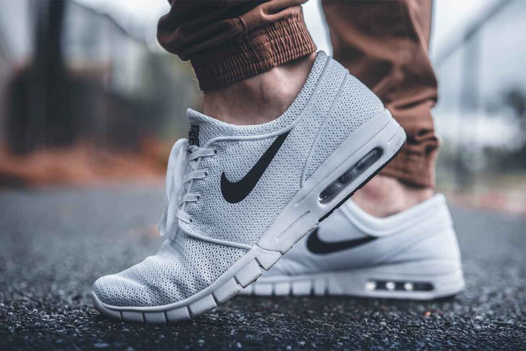
Nike started its life as Blue Ribbon Sports, and the story goes that a graphics student named Carolyn Davidson designed the swoosh as we now know it for $35. That’s a bargain if you ask us! However, due to its resounding success, the company rewards her with lots of brilliant freebies as well as 500 shares of Nike stock. It sounds like a win-win, but for one of the greatest logos of all time, we still think it’s pretty cheap.
 6. Chanel
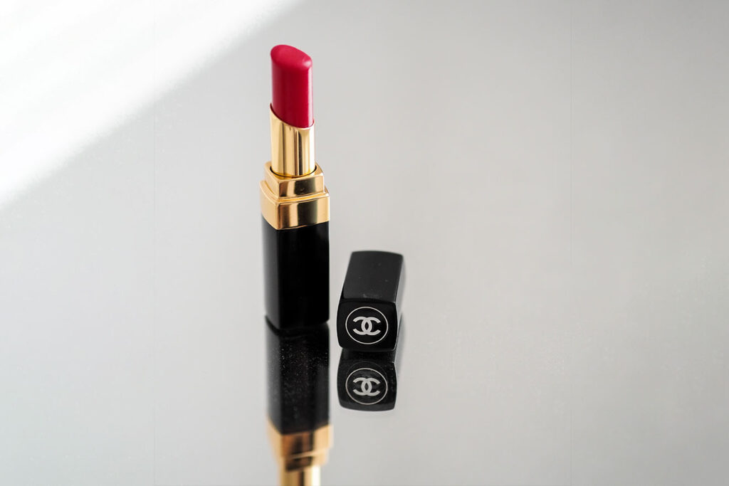
Chanel is one of the biggest names in the world of high-end fashion. As one of the world’s most significant fashion houses, you may wonder why they need a memorable logo? Well, the interlocking double C logo is a nod to their minimalist yet eye-catching designs.
The logo also involved the initials of the founder Coco Chanel and therefore ticks lots of the ‘must have’ boxes when it comes to logo design.
 7. Coca Cola
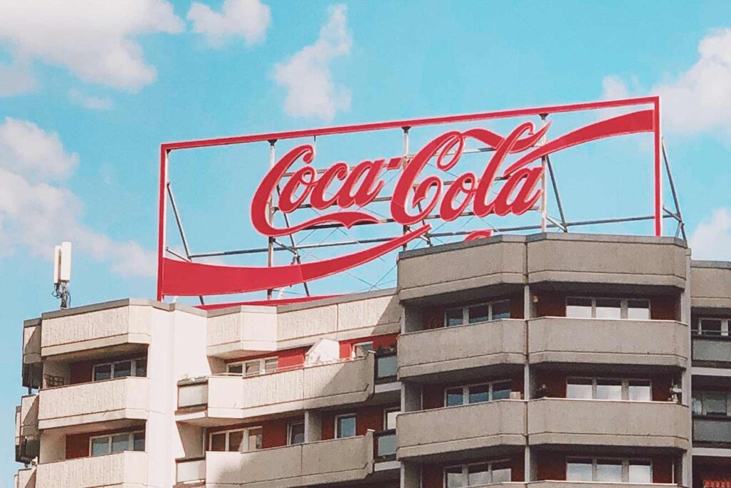
Did you know that the script-style font used in the Coca Cola logo has only been tweaked a tiny amount since the company first hit the stores? Coca Cola is probably the most significant brand globally, and it shows exactly what a brand can become if nurtured over time.
This timeless design is built around a fun and memorable font, that focuses on the brand’s association with happiness.
 8. Apple
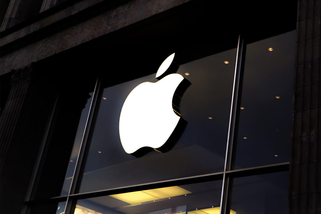
The Apple logo we know and love today hasn’t been around all that long! But now, it is known as one of the most eye-catching and instantly recognisable logos in the world. The Apple logo symbolises the company’s sleek and desirable designs and is incorporated in one way or another into every product that they sell.
 9. Mickey Mouse
Mickey must be a shoo-in for everyone’s favourite mouse? As the mascot of Disneyland, Mickey is a symbol of joy and happiness and is undoubtedly one of the most recognisable logos in the world, despite initially being a character.
The combination of three circles makes the logo a pleasant shape to look at. Using a known character as a logo is a great way to associate feelings with the design. The logo is as positive and happy as the mouse himself.
 10. Pepsi
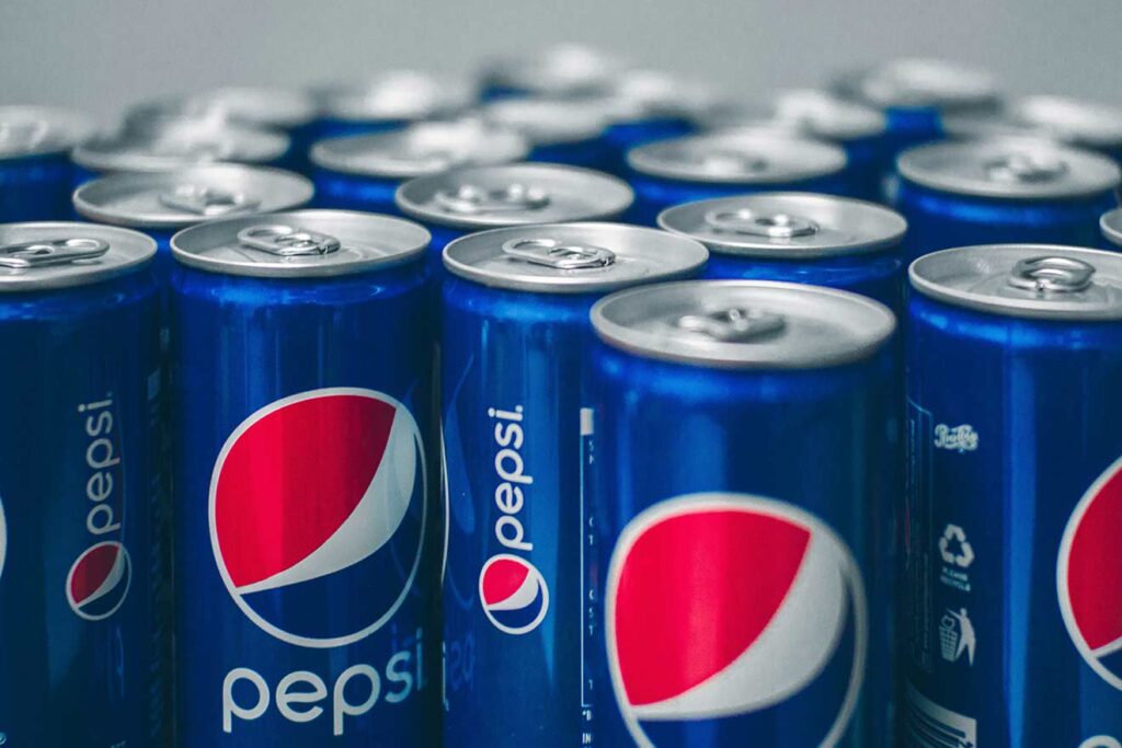
Despite being around since 1898, Pepsi has continued to finetune its logo. The company aims to offer exactly what its customers want, from the white, red and blue globe that has stood alone for many years to the returning script font, which has been rolled back out by the marketing boffins at Pepsi.
With or without the name, Pepsi is as recognisable as it’s always been, 120 years and counting.
At Create8, we are a design agency that pours soul into every project that we take on. Your success is as important to us and is it to you! With that in mind, we build every one of our bespoke projects to offer your business the best chance of thriving within your sector.
You’re in luck because logo design is our absolute forte! Follow the link below to see some of the fantastic jobs we’ve had the opportunity to work on in the last few months!
Whether it requires building a brand from the ground upwards and creating something bespoke to stand out from the crowd.
Maybe it’s a refresh that your business needs, we have all the experience and know-how to help your brand be the one that everyone remembers. Send us a message and a little information about your logo design project, or pick up the phone and give us a call; we can’t wait to hear from you.
Take a look at some more of our blogs for helpful tips, tricks and advice:

