Using colour to evoke emotion and shape perception
Colours can evoke emotions and shape perceptions, which makes them crucial to every branding strategy.
By using brand colours consistently, businesses can create a stronger and more easily recognisable identity. An effective colour palette also resonates with the target audience, sparking the desired emotional responses and inspiring action.
The strategic use of colour in branding not only strengthens brand association but also has the potential to boost sales and customer loyalty.
In this article, we’ll explore the fascinating psychology behind colour and discover how businesses can effectively harness its power to send the right message to their audience, elicit emotions, and, ultimately, achieve branding success.
What do we mean by colour psychology?
We’ve all experienced the emotional power of colour at some point in our lives. Just think back to that pink-hued sunset that filled you with a sense of awe and wonder. Or the turquoise sea that washed over you and left you with a feeling of peace and tranquillity. And do you remember how that bright red sports car filled you with excitement?
Colour psychology studies how humans perceive and interpret different colours, including our emotional, behavioural, and psychological responses.Each colour is thought to have unique psychological properties that convey specific messages and evoke distinct emotions.
 What’s the importance of colour in branding?
Whilst a carefully selected colour palette can make a design more visually appealing, our responses to colours are more profound than mere aesthetics.
The colours you choose for your brand can subconsciously influence the feelings and emotions of your target audience, shaping their perception of your brand and their willingness to engage with it.
The inherent connection humans have with colour is something businesses can harness to create a lasting impression on their target audience. And if they do that? They’ll have a stronger brand identity and increased customer engagement.
Your brand colours will be used across your business, including in your logo, and on your website, product packaging, advertising, and marketing materials. Consistent use of a well-thought-out colour palette across all of these touchpoints will reinforce brand recognition and help to create a unified experience for your customers.
Common colour associations
Understanding the specific emotions and associations that colours can evoke is essential to selecting an effective colour scheme for your brand and logo.
Generally, colours can be divided into two categories: warm and cool. Warm colours like red, orange, and yellow often convey excitement and energy, whilst cool colours like green, blue, and white evoke calmness and tranquillity.
Whilst colour psychology and associations are helpful when used as a framework for selecting colours, it’s important to note that cultural differences may influence these associations (more on this later).
The most common and globally recognised colour associations:
- Red – Exciting, strong, attention-grabbing, fierce, passionate, energetic.
- Yellow – Happy, fun, optimistic, youthful, knowledgeable, confident.
- Light blue – Tranquil, sincere, trustworthy, transparent.
- Dark blue – Secure, formal, professional, wise, dependable.
- Orange – Playful, exuberant, warm, friendly, lively.
- Green – Nurturing, natural, calm, lucky, refreshing, healing.
- Pink – Feminine, romantic, innocent, youthful, kind, playful.
- Purple – Luxurious, mystical, creative, affluent, dignified.
- Black – Edgy, contemporary, refined, sophisticated.
- White – Simple, innocent, pure, peaceful, clean.
- Grey – Neutral, classic, mature, serious.
- Brown – earthy, rustic, rugged, old-fashioned.
Whilst by no means exhaustive, this list gives examples of some of the most common and globally recognised colour associations.
It’s easy to see why particular colours have become synonymous with specific industries. For example, red is associated with excitement and energy, making it a good choice for the entertainment and sports industries. Pale blue, on the other hand, helps to create a sense of sincerity and trust, making it a popular choice for healthcare, finance, and technology.
However, it’s worth remembering that there are no hard and fast rules when it comes to which colours are right for your brand or industry. There are always exceptions to the rule, especially when it comes to disruptive brands that are successful because they don’t follow the norm.
 What other influences affect our colour associations?
When it comes to our colour associations, colour psychology should only be used as a framework for our choices, as several other factors are at play.
Our colour associations are also heavily influenced by culture, era, hue and tone, colour combinations, preferences and experiences.
Culture
Different cultures have different colour associations, which can change over time. For example, in the Victorian era, blue was associated with girls and pink with boys, but somewhere down the line, this got flipped!
Sector
The sector that a business operates within can also significantly shape colour associations. For instance, customers associate healthcare industries with cleanliness and tech companies with innovation, so when the colour white is used in the branding within either sector, it will likely evoke different associations. White may symbolise sterility and purity in healthcare, while in the tech sector, it could represent cutting-edge technology and a sleek, modern aesthetic.
Hue and tone
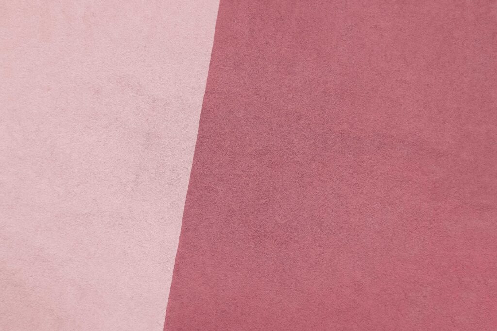
Different tones and hues of colours can elicit different reactions and associations. For example, pale pink may feel more gentle and innocent than hot pink, which might feel more racy and exciting.
Colour combinations
Colour associations can also be influenced by the other colours a colour is paired with. Supporting colours can change our perception and overall impact of colour. The colour combinations used in a design can be just as important as the individual colours themselves.
Personal preference
Individual tastes, preferences, and experiences can also impact our colour associations. For example, if you hate the colour yellow, you may not feel joyful and optimistic when presented with it, despite its traditional associations.
 Design elements
Colour is just one part of your branding and design; it works alongside other design elements like your font, layout, logo, and imagery to create your brand’s visual identity. All these elements must work in harmony to create a consistent message. If your logo design doesn’t evoke the same associations as your brand colours, the feelings and message you’re trying to create could get lost.
How to choose the right colours for your brand
The colours you choose for your brand and logo will have a direct influence on how it is perceived by your target audience. This means it’s essential to select colours that align with your brand values, personality, message, and industry.
Follow the steps below to discover the best colours for your brand.
Revisit your brand identity and values
When selecting your brand colours, you should consider other aspects of your branding, including your brand voice, personality, and values. These elements should guide your colour selection process and help you to ensure that the colours you choose align with your overall brand identity.
Consider your target audience
Ask yourself, who is your target audience? What are their demographics, and what do you want them to feel when they interact with your brand? Align your colour choices with the emotions that you want to elicit within your audience.
Look at colour associations
Learn more about colour psychology and associations. This will help you to understand which colours align with your industry, the brand personality you want to create, and the emotions you want to evoke.
Choose a colour scheme
Consider how many colours you want to use in your branding. There are several types of colour schemes to choose from, including:
- Monochromatic (different shades of a single colour)
- Analogous (colours that are adjacent on the colour wheel)
- Complementary (colours that are opposite each other on the colour wheel)
- Triadic (three evenly spaced colours on the colour wheel)
Often, brands choose one colour that will serve as the primary colour for their brand, a secondary colour that complements the primary colour and adds variety to their palette, and an accent colour. Consider applying the 60-30-10 rule, this is an interior design principle that can be used to create a sense of balance in your colour palette. 60% primary colour, 30% secondary colour, and 10% accent colour.
However, sometimes less is more when selecting colours for powerful branding.
According to Adobe, 95% of the top 100 brands only use one or two colours in their branding. Taking a simple approach to your brand’s colours will make it easy to maintain consistency.
Explore tints, tones, and shades
Experiment with tints, tones, and shades to create colour variations. These subtle differences in shade can evoke different emotional responses and enable you to fine-tune your colour scheme.
 Tips and tools for creating a cohesive and compelling brand colour palette
Creating a brand colour palette that looks the part and reflects your business’s brand values and personality is no easy feat. Here are some tips and tools to help you.
List adjectives – Start by creating a list of adjectives that describe your business’s values and personality. You can then compare these adjectives with the typical colour associations we covered in this article to help you select colours that accurately reflect your brand.
Create a mood board – Creating a mood board can be a great way of discovering the colours that you most associate with your brand. Collect images that inspire you and represent your brand’s identity, collate them all onto a board and analyse which colours are dominant to help inform your brand colour palette.
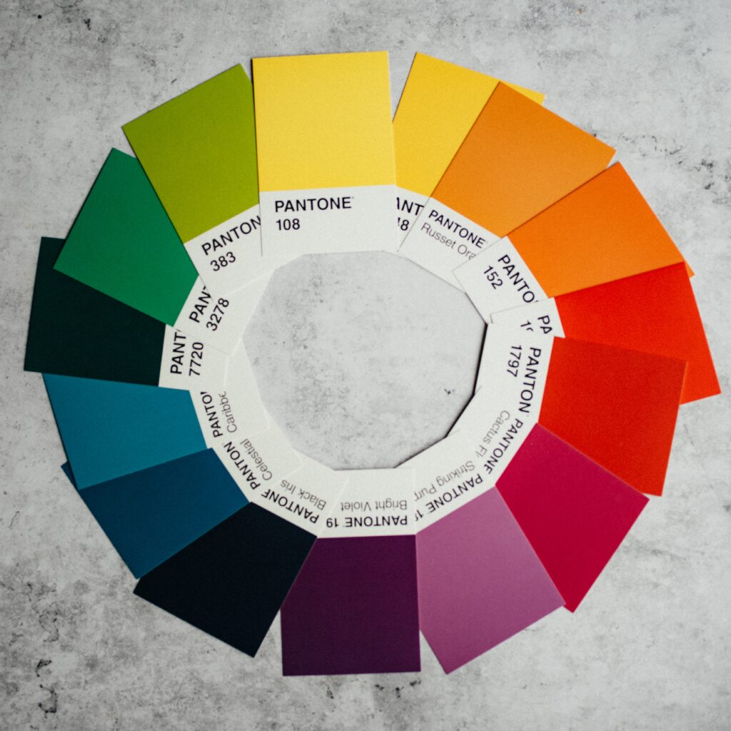
Utilise the colour wheel – A colour wheel is an excellent tool for exploring which colours work well together to create a balanced and visually appealing palette.
Use a colour palette generator tool – A quick search on Google and you’ll discover plenty of free colour palette generator tools to suggest colour palettes that work well together based on your input. Popular colour palette generator tools include Adobe Colour and Khroma.
Test your colour palette – Before finalising your colour palette, it’s crucial to test the colours to see how they work together in different contexts. You should also test your colours for accessibility; you can use the free WebAIM Contrast Checker tool.
Dare to be different – While considering your industry and competitors is essential, standing out and being unique in a crowded marketplace is also important. Don’t be afraid to choose unexpected or unconventional colours if you believe they accurately reflect your brand’s identity.
Create8 branding services
Here at Create8, we help businesses to create meaningful brand identities.
Our strategic branding services incorporate all aspects of the branding process, including logo design, creation of brand personality and brand voice, selection of brand colours, and brand strategy.
Contact us for help with your brand identity and increase customer engagement today!
FAQs
What is colour psychology?
Colour psychology is the study of how colours affect human behaviour and emotion.
How does colour psychology play a role in branding and marketing?
According to colour psychology, the colours that businesses use in their branding and marketing can evoke different emotions and associations amongst their audience. Therefore, choosing colours strategically to resonate with your target audience could help to drive purchasing decisions and boost brand loyalty.
How can I choose the right colours for my brand based on colour psychology?
There are many factors to consider when selecting the right colours for your business branding, including your target audience, cultural colour associations and emotional responses, and which colours align best with your brand identity, personality, and values.
Are there any universal rules for colour association, or do they vary across cultures?
No colour meanings are 100% universal; however, some associations are more widely shared across cultures. For example, red is associated with passion, blue with calm, and green with nature. It’s vital to research cultural differences when selecting colours for your branding.
What are some successful brands that have leveraged colour psychology in their branding?
- Starbucks’s branding is green and white, colours that are associated with freshness, nature, and environmental consciousness. An excellent combination for a food and drink company that wants to highlight its commitment to sustainability.
- Tech giant Apple uses white and silver in its branding and marketing. This combination is simple, fresh, contemporary and elegant and can also be associated with innovation. Great choices for one of the world’s most prominent and innovative tech companies.
- Lego’s red, yellow, and white branding screams energy, fun, and positivity, an accurate representation of their brand and products.


 What’s the importance of colour in branding?
 What other influences affect our colour associations?
 Design elements
 Tips and tools for creating a cohesive and compelling brand colour palette


