Colour plays a crucial role in branding and design. Whether you’re designing a logo, developing a website, or printing marketing materials, choosing the right colour system is how you ensure colour accuracy and consistency across different media.
The three primary colour systems used in design and branding are CMYK, RGB, and Pantone. Each has unique characteristics, advantages, and limitations. Let’s take a look at what these colour systems are, how they differ, and when to use them for brand design and marketing.
When should I use a CMYK colour system?
Used for: Physical packaging, brochures, posters, magazines
The CMYK system is named after the four colours used in the physical printing process: Cyan, Magenta, Yellow, and Key (or just black). The system relies on a subtractive colour model, where colours are created by layering actual inks – the more ink that’s added, the darker or more intense the colour becomes.
CMYK printing works by applying layers of ink in a tiny dotted pattern. Each layer absorbs light, and the overlapping dots blend together to create different colour tones. By combining cyan, magenta, and yellow you should (in theory) get black, but because of ink impurities, true black is achieved by adding the “K” component.
Due to the method of actual, physical, mixing of inks, CMYK is able to reproduce a wide range of colours, making it the preferred system for printing packaging or marketing materials in higher volumes – materials that rely on a combination of brand colours. And by adding an additional toner cartridge (a “5th colour”), an even wider variety of colours are possible.
Because it works with almost all printer types, CMYK is the most cost-effective and accessible colour system for smaller brands, or when margins are tighter.
The final colour result does depend on the type of paper and printer settings, which can cause slight variations in colour – CMYK is the preferred colour system for printed materials, but it may not be the most accurate. Colour variations may occur across different printers and paper types so it’s not ideal for exact colour matching – and you can’t really achieve vibrant colour types (such as pure neons).
While CMYK is the go-to for print, digital design requires a different approach – this is where RGB often comes in.
When should I use a RGB colour system?
Used for: Digital brand elements, website and app design, social media graphics and video content
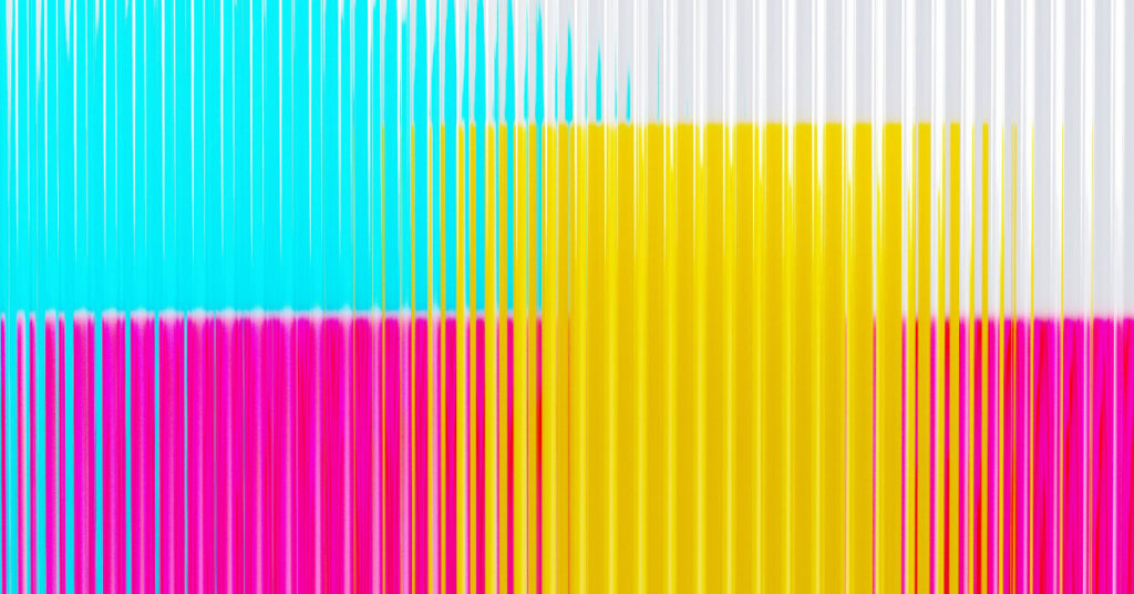
Unlike CMYK, which subtracts colour from white, RGB adds light to create colours. RGB stands for Red, Green, and Blue, the three primary colours of light used in digital displays.
To explain it simply, if you mix all three primary colours at their highest intensity, you get white. If you remove all the colours, you get black (the standard digital display colour). Each pixel on a digital screen emits red, green, and blue light at different intensities.
RGB colour values range from 0 to 255, and are displayed in hex codes (#FFFFFF for white, #000000 for black) – you may have noticed these if you’ve used a digital design program. There are millions of potentially bright, saturated colours that can be achieved by combining different values, making RGB ideal for screens and digital media.
RGB is essential when it comes to any screen-based design work. Unlike CMYK, RGB colour systems are inherently digital, and tones that may look one way on one screen will often appear differently on another screen or when printed.
RGB is used most often in web design, mobile apps, social media graphics, and video content. It’s possible to convert RGB colours to either CYMK or Pantone systems, but make sure you’ve worked this into the design plan and budget if you want to go down this route.
While RGB is perfect for variety, it doesn’t guarantee colour consistency. For brands that need absolute precision, Pantone is widely considered to be the gold standard.
Don’t have time to make mistakes with your digital marketing designs?
Get expert help from the Create8 team, with proven results from successful clients. Get in touch to get started on your brand or web design project!
When should I use Pantone colours?
Used for: Brand and corporate identity, logos, packaging, high-end printing
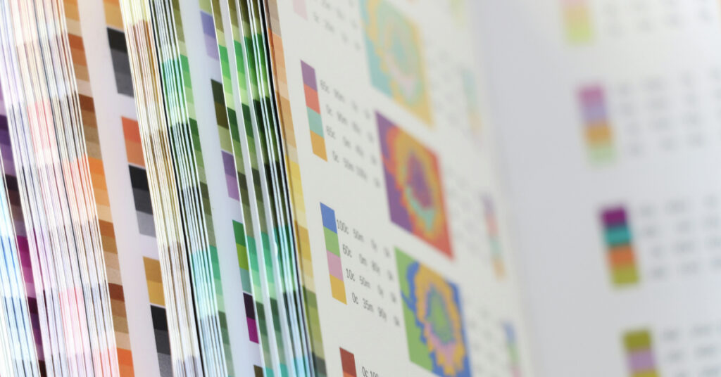
Finally, let’s take a look at the colour system that most people are most familiar with, even outside of product and branding design. The Pantone Matching System (or PMS) is a standardised colour matching system used to ensure exact colour consistency across different materials and production methods.
Unlike when blending colours using CMYK or RGB, Pantone colours are pre-mixed spot colours made using specific ink formulas. Each Pantone colour is assigned a unique code, intended to remain consistent across different print and paper types. This means that precision is the focus with the PMS, making it best for projects where accuracy is essential (think brand logos, product packaging, or even fashion).
Pre-mixed Pantone colours mean that brands can achieve perfect colour accuracy across products and marketing materials – reducing discrepancies across different methods of printing or presentation. Pantone can also produce colours that are simply not achievable through RGB and CMYK systems (e.g. metallic and neon shades).
Sounds good so far, but what are the downsides? Mostly, it’s not cheap. Pantone’s full colour library isn’t free – businesses need a paid license, and some premium shades require an extra subscription through Pantone Connect, with prices starting at almost £90 per year, per user. And due to the pre-mixed nature of the colour chart, it may be restrictive to brands that are looking to use more colour or mixes.
What’s the difference between Pantone, CMYK, and RGB colour systems?
| Pros | Cons | USP | |
| CMYK | Cost-effective; Wide range of applications | Inconsistent colours; No neons or metallics | Layers of ink in physical printing – best for full-colour print jobs, like magazines and brochures |
| RGB | Vibrant tones; Millions of colours | Inconsistent across different mediums | Light-based colour mixing – ideal for digital displays, including websites and social media |
| Pantone | Precise colour matching; Consistent across all print materials | Expensive licensing | Pre-mixed spot colours – perfect for branding, logos, and packaging requiring exact colours |
Struggling to keep your brand colours consistent?
Understanding CMYK, RGB, and Pantone colours is key to maintaining brand consistency. Need expert guidance? Our team at Create8 ensures flawless colour precision – let’s bring your brand vision to life.


