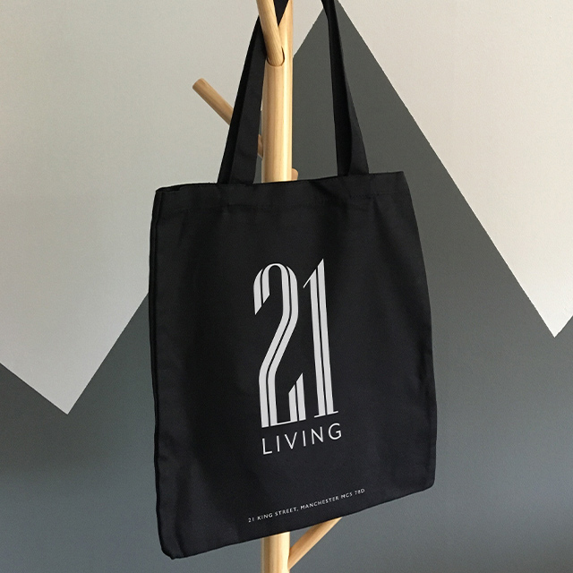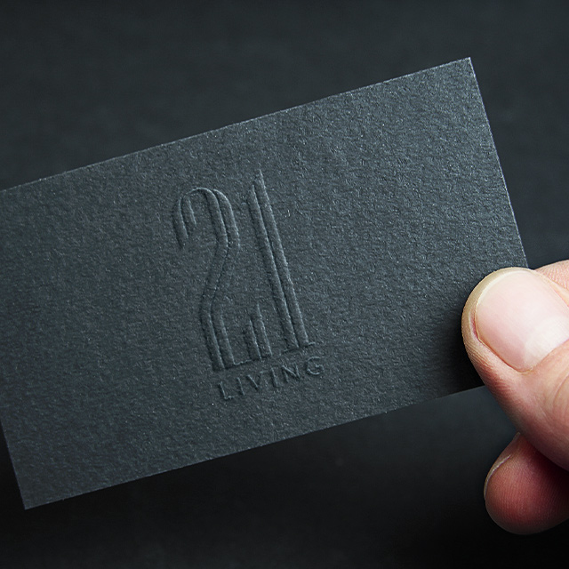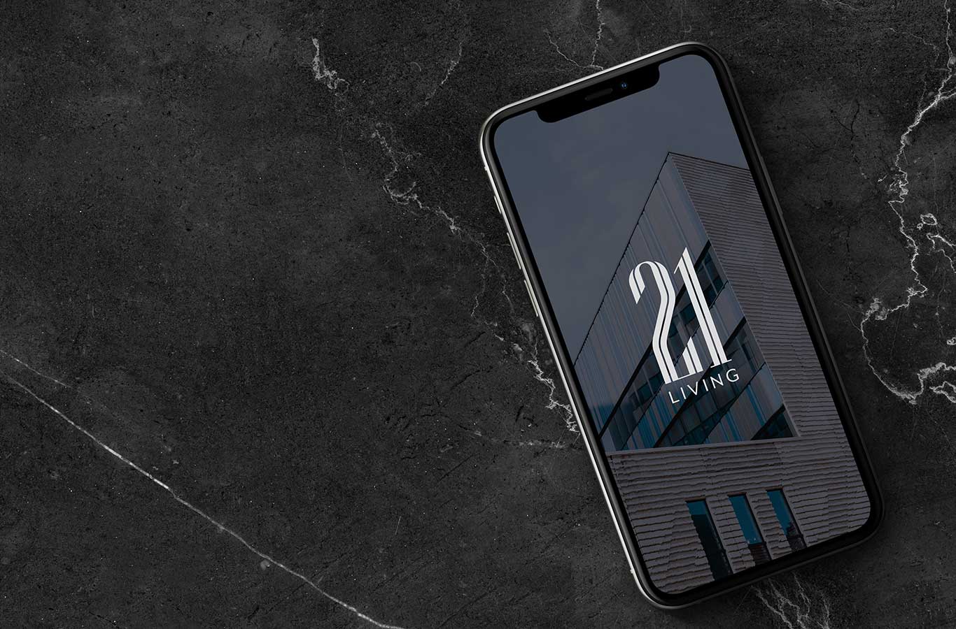

21 Living, a brand new property development firm, contacted Create8 to work on modernising their brand identity. Having already worked with brands wanting to bring a modern twist to their branding, this project was right up our design team’s street.
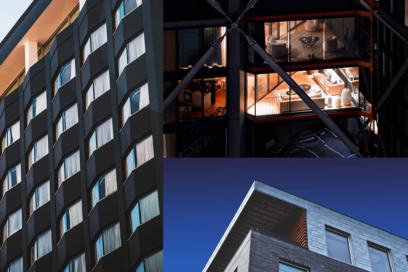
By looking at visual references like the skylines of modern cities, the team at Create8 brought this brand to life. With visual concepts aimed at attracting a new wave of young, sophisticated and forward thinking clientele from within the property market.
Their new icon is tall and angular; it takes inspiration from classic art-deco architectural styles whilst keeping it modern and contemporary. With the city centre in mind high rise apartment blocks can also be seen in the towering 21.
“We initially spoke to Create8 through a recommendation from a friend. We didn’t particularly have a style of brand in mind so left Create8 to come up with ideas, we were not disappointed! The final product portrays our company image perfectly. We’re currently having a website built and have asked Create8 to rebrand two of our other companies. Great team, service and end product. We would highly recommend to any company, from start up through to long established.”