There is far more than meets the eye when it comes to perfecting your packaging. In this blog, we’re highlighting the top 5 printing errors countless businesses are making.
It turns out that the consumer loves shopping from the comfort of their own home; who would have thought? As more of us are finding the time to shop from our beds, sofas and even the bathroom, brands have become responsive to online shopping in many ways. The most significant change has seen companies throwing their money into innovative packaging solutions. Whether it’s boxes that are 100% recyclable or reusable sturdier options. Businesses have attempted to recreate the physical shopping experience by offering something special when it comes to packaging, and we are all for it. But are printing errors hindering some companies?
 It usually takes us around 2 minutes after placing an order before we start looking out the window for the delivery driver’s arrival. So when it does arrive, as consumers, we want to feel valued. However, as a graphic design agency specialising in package design, we still encounter countless mistakes that businesses are making.
Making printing errors on your packaging can be extremely costly and also very embarrassing, so it’s time to get this right the first time. Follow this blog, soak in the tips, enjoy the Manc charm, and you’ll do no wrong!
Cutter guides/templates
Firstly, let’s get this straight, companies of all sizes make mistakes. You could have a multi-million-pound budget, but things still slip through the net. That being said, if you have a keen eye you should be okay.
Make sure everything lines up correctly on your cutter guide or template, front and back. It may look too big on-screen but remember to consider the final print size. It’s time-consuming and fiddly but the best way to visualise your packaging on this cutter design is to print it, cut it out and build a tiny version of the packaging. This kind of hands-on building can be a treat for us Adobe designers!
 Not proofreading

Okay, not to sound obvious, but proofreading is a much more difficult task than it initially sounds. Spelling, grammar and punctuation mistakes can make your business look unprofessional and represent your brand poorly.
Our advice is that you don’t rely solely on yourself when it comes to proofreading. Make sure you have at least one other colleague check every last word before sending your packaging to print.
The easiest thing you can do is copy your text into word or something like Grammarly and let these applications underline the errors for you.
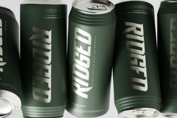
Low-resolution images
If you’ve thought about making something genuinely stand out for your packaging, you have probably looked into the idea of having full-bleed imagery integrated into it. However, using imagery on packaging can be a big mistake if the file is low-resolution.
On our computer screens, images are around 72ppi (pixels per inch), whereas, for the sake of packaging design, your image needs to be closer to 300dpi (dots per inch). If you aren’t using high-resolution imagery at the correct size, you may need to prepare for an image fuzzier than a bear’s stomach.
Call to action: – As a design agency that specialises in package design, there aren’t many issues that we haven’t come across. Suppose you are currently looking at how to ‘wow’ your customers with your package design; check out the link below. Have a wander around some of our past projects, and hey, if you feel like it, get in touch and let’s talk about you.
Embedding your fonts

You’ve spent hours on your packaging, and you are finally happy enough to send it to print. So imagine this, your artwork arrives at the manufacturer, and your font gets switched out for another. The very thought makes us shudder. You haven’t worked so long on your branding for your package to look like it belongs to someone else!
Printing errors like this are actually far more common than you may think. For example, if your brand relies on the use of a specific font that you have had to download, if you fail to embed/outline the font within the document you send to your designer and then manufacturer, they may not have it downloaded. In which case, the font may be switched out for one that looks nothing like the one you have chosen.
Using RGB instead of CMYK
Another printing error you may not know exists within the screen to print sector is the use of inks that make up the colours. In four-colour printing, the colours are made up of four inks CMYK, Cyan, Magenta, Yellow and Black (the K stands for key), whereas images on a screen are RGB, Red, Blue and Green.
This problem is not strictly reserved just for the imagery you use on your packaging but is also the case for the entire artwork. If you provide a manufacturer with an RGB file, prepare for the unexpected. When sent to print, RGB can look washed out and produce colours that look nothing like they did on your screen. Be careful not to fall at the last hurdle.

As a design agency, we’ve taken note of all the printing errors so you don’t have to. When making sure that your packaging design project is perfect for you, we implement a completely collaborative outlook. We are an agency that supports your business every step of the way. You provide us with the scope of the results you want to achieve, and we will begin to build something mould-breaking and mind-blowing for your business.
Don’t be afraid; let’s collaborate today. Follow the link below, and let’s get down to business.
Take a look at some more of our blogs for helpful tips, tricks and advice: