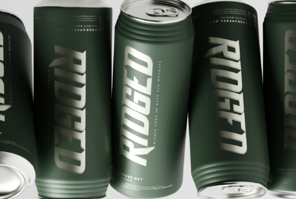
Impactful packaging design
Packaging design isn’t just about how your product looks on the shelf, though that’s definitely an important element – it also offers an experience for your target audience. That’s right, great packaging is a physical touchpoint that provides a kind of sensory interaction and brings consumers back to your brand again and again.
Once you’ve developed your product to perfection and built your brand from the ground up, you need impactful packaging design to get your product into consumers’ baskets. Read on to find insider tips from a packaging design agency!
How does packaging design influence consumer perception of a brand?
Your product packaging is most often going to be the first physical interaction that consumers have with your product. It creates consumers’ first impression of your brand, and influences their judgement of product quality. Even if your product is perfect, poorly designed or boring packaging can discourage people from picking it up off the shelves.
Great packaging evokes relevant, powerful emotions (like excitement and trust) and fosters a positive connection between consumer and brand. When done well, it helps to differentiate your brand from competitors and reinforce your identity in the market.
What role does packaging play in marketing?
To be more specific, clever brand packaging helps to boost brands in three areas that are essential for success:
Brand visibility
Packaging design can be used as a powerful marketing tool by grabbing the consumers’ attention, whether on crowded shelves or seemingly endless online stores.
Storytelling
Every strong brand has a story or message that creates a tie between itself and repeat customers. Great packaging design tells this story about the brand’s values or product’s uses.
Memorability
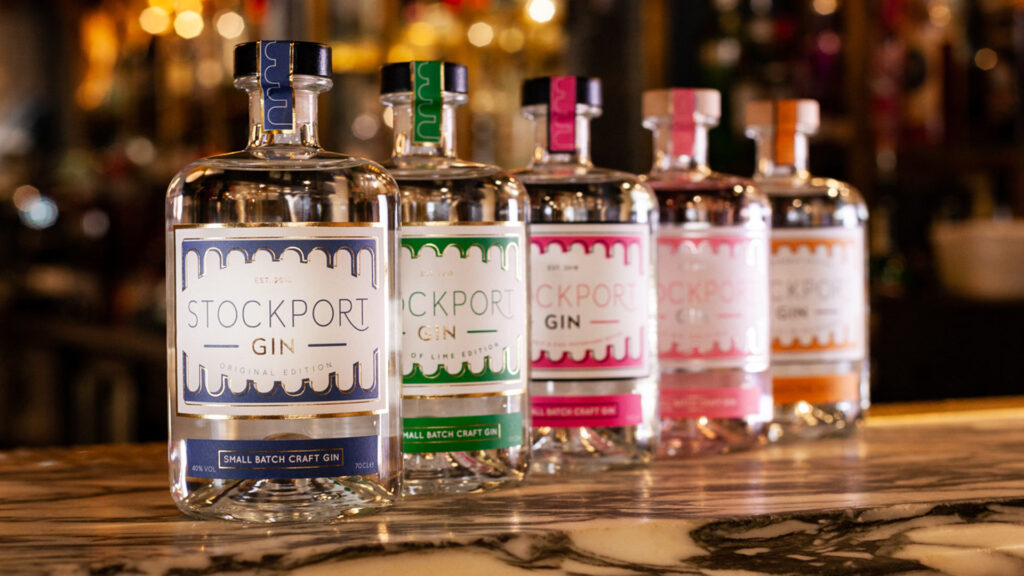
Unique packaging design helps your product to stand out; and having a distinct and memorable design helps to foster a sense of consistency in your brand.

How can effective packaging design enhance brand recognition?
It’s one thing for your product to stand out, but it needs to be memorable and recognisable as well. Consistent design elements create a visual identity for your brand. Logos, colours, and fonts are all essential, but you should also consider physical factors such as the materials and shapes used in your packaging design.
We can help you to create unique packaging design that reflects your brand’s values and personality and helps consumers find your products. Request a free proposal to get started!
How does packaging design impact consumer purchasing decisions?
All effective packaging design directly influences consumer purchasing decisions by creating an emotional response. Visually appealing and functional packaging attracts attention, conveys quality, and builds a sense of reliability and trust.
How can packaging design improve customer experience?
Personal touches, sustainable materials, and going into the finer details such as the unboxing experience; these all foster customer loyalty and encourage repeat purchases. Considering aesthetics as well as functionality, and creating a memorable experience through packaging design, creates a sense of personal connection for consumers with your brand – and improves the overall customer experience with your product.
What are the key elements of successful packaging design?
Don’t just jump into your packaging design – it’s a multi-step process!Before you begin the packaging design process, make sure you’ve got a plan in place.
- Functionality: The packaging design that you implement should not only look great, but also protect the product during shipping, storage, and use. It should ensure both durability and practicality, without sacrificing aesthetics.
- Visual Appeal: As we’ve mentioned, an eye-catching packaging design that promotes consistent brand identity helps your product to stand out on crowded shelves whilst communicating the brand message.
- Sustainability: Using more eco-friendly materials appeals doesn’t only appeal to the environmentally conscious consumer – it also fosters longevity for your products and brand. Great packaging design minimises waste while remaining effective.
- Usability: Think about customer experience when actually using your product, not just the branding on the shelf. User friendly packaging and accessible design – such as resealable pouches or ergonomic shapes – offer practical value to consumers.
- Cost-effectiveness: The best packaging design is one that doesn’t compromise on any of the above key elements, whilst still not breaking the bank. Balancing innovation with budget constraints can be challenging, but successful packaging design must maintain quality and brand integrity, as well as meet financial limitations or goals.
What are the latest trends in packaging design?
Designing product packaging that leans into recent trends whilst still having an element of longevity is essential to successful packaging design.
Sustainability features have become central to successful packaging design in recent years. Brands are increasingly focusing on eco-friendly materials, reducing plastic usage, and incorporating recycled materials into their packaging and products. Additionally, other brands have focused on better inclusivity, through measures such as adding Braille to packaging design.
Interactive or custom packaging is a current trend with leading brands. Nutella and Coca-Cola have both had campaigns allowing customers to customise product labels as collectibles or gifts, and the latter also has QR code-accessed digital content. Textured packaging is also gaining traction, with the purpose of offering unique sensory experiences to consumers outside of just great aesthetics. But this isn’t always cheap, so make sure it fits in your budget!
Minimalist packaging design, emphasising simplicity and clarity, will always be on-trend. But recently some brands have embraced maximalism, such as Tony’s Chocolonely and Pukka Herbs. They use bold, vibrant colours, intricate patterns or complex designs to stand out on the crowded shelves. Nostalgic, timeless, retro styling, is also making a comeback; appealing to consumers’ fond memories and evoking a sense of security. Different target consumer groups will have different preferences, so make sure to do thorough market research before making any final decisions.
What are the environmental considerations in packaging design
To have truly environmentally friendly packaging design, you need to consider the entire production process from start to end. Think about the materials used and their expected life cycle, the energy consumed in production, and the longevity of the packaging, Can it be recycled? Is it reusable?
What are the legal and regulatory considerations for packaging design?
In the statutory guidance provided by the government, there are three broad and essential requirements for packaging design that must be followed.
Potentially hazardous or noxious substances must be minimised, and there are strict limits on the use of heavy metals in packaging design. The manufacturing process should permit reuse or recovery of materials, as per any specific requirements for said materials. And the packaging volume and weight needs to be sufficient for safety and hygiene.
You can find full and detailed regulations in the PDF provided on the .gov page so make sure you’ve read and understood this before starting to create your packaging design.
Are your packaging designs truly captivating your target consumer?
At Create8, we understand that exceptional packaging design is more than just aesthetics; it’s a strategic tool that can influence purchasing decisions and enhance customer experience and loyalty. Our services – from in-depth packaging research to innovative graphic design – help guarantee your brand stands out. Whether it’s in the form of sustainable materials or unique design concepts, we craft packaging solutions that resonate with consumers and reflect brand values. Let’s elevate your packaging design together!