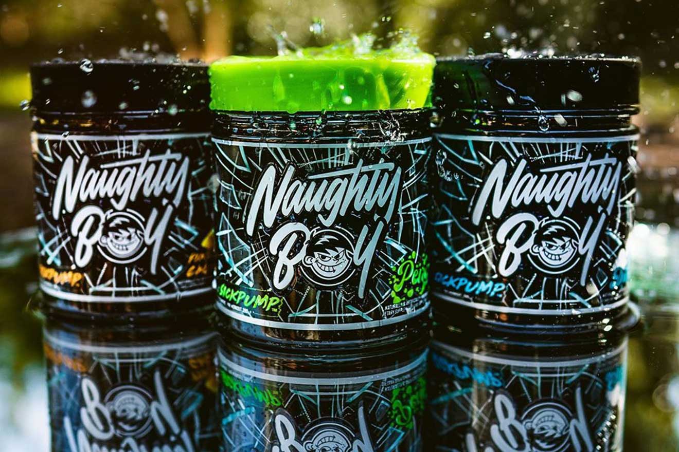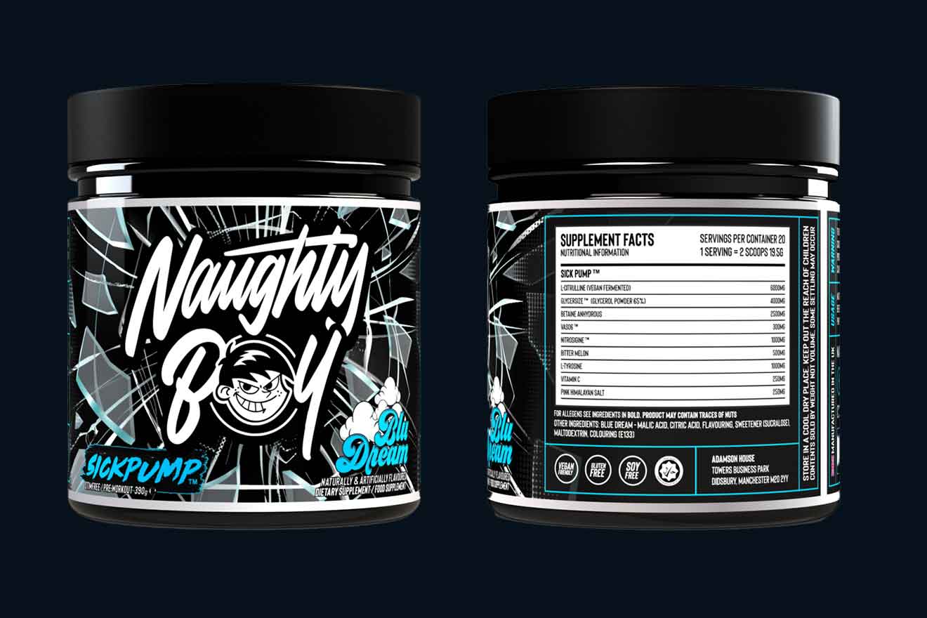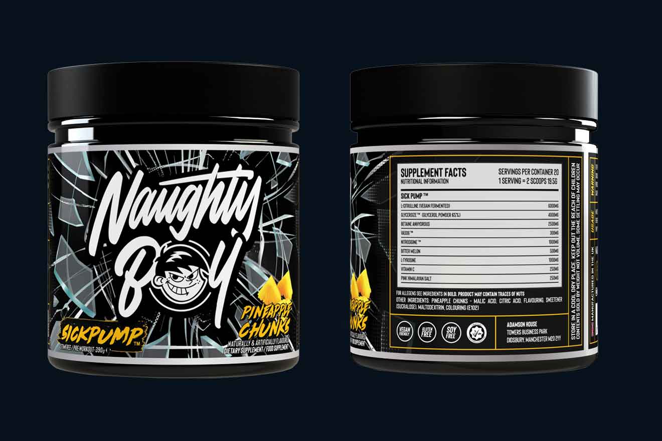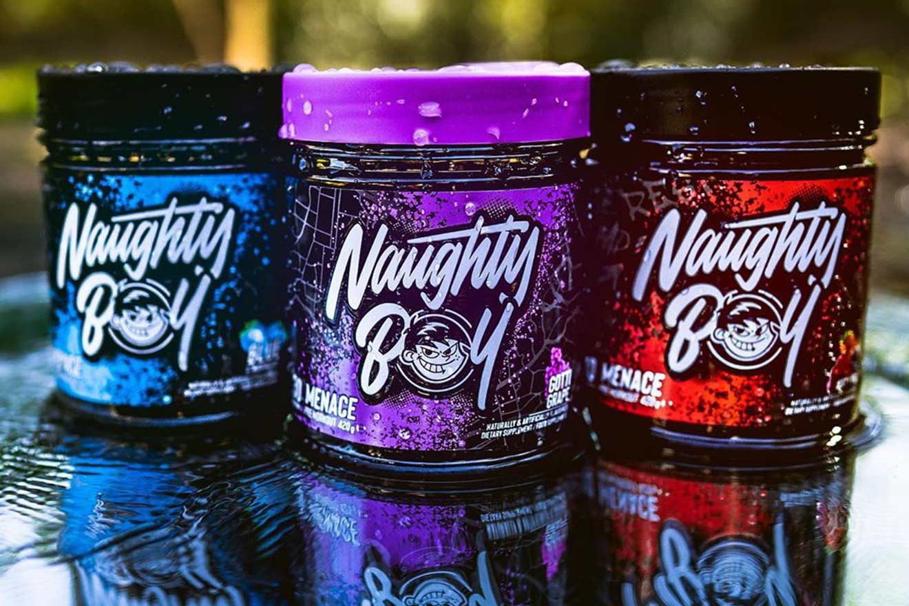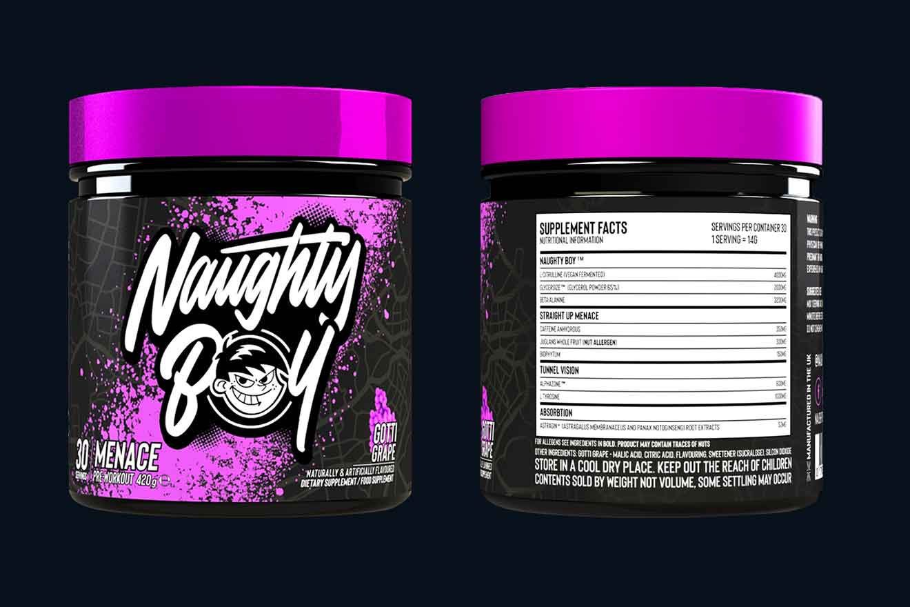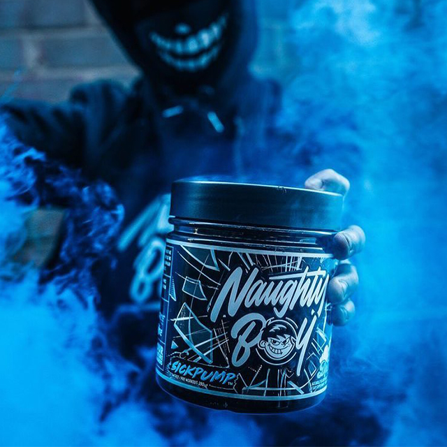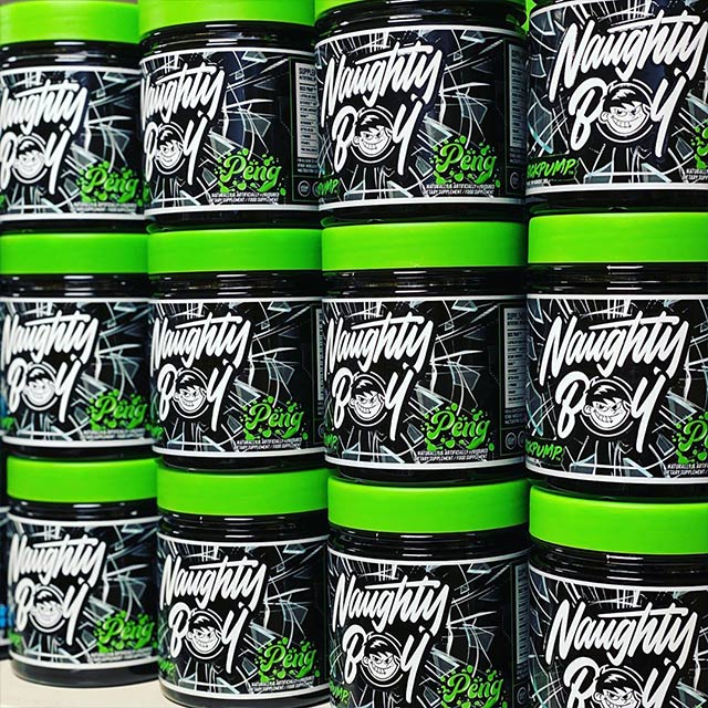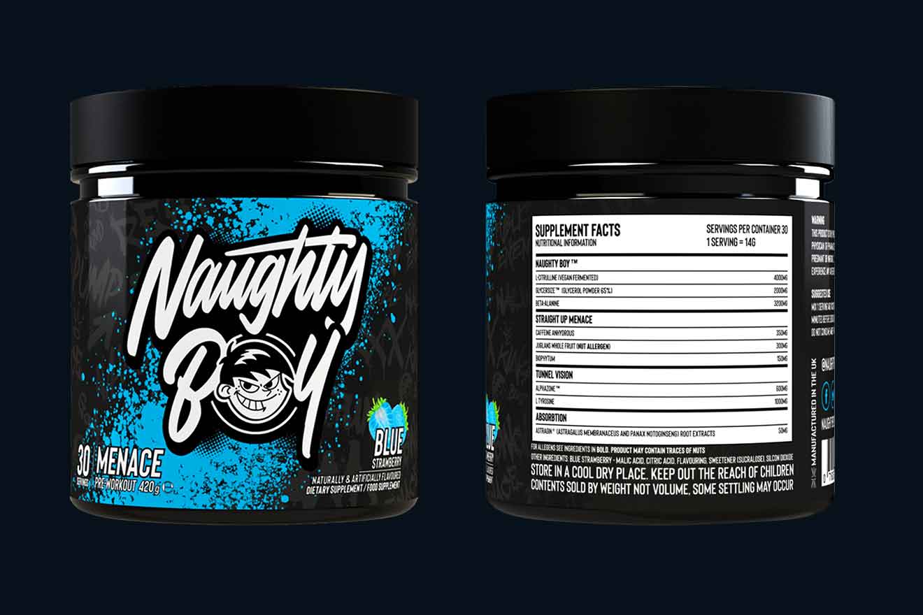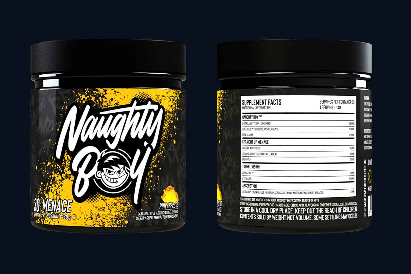
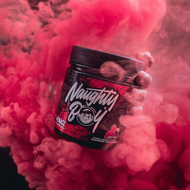
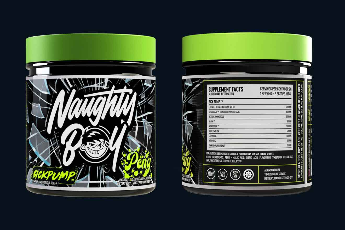
Brand identity and packaging for Naughty Boy, a supplement brand from Manchester with a goal to change the industry.
Naughty Boy came to us wanting to enter the fitness industry, but in a way which would bring into play something totally new and disrupt the industry. Needless to say, we were more than happy to collaborate. This is how our long standing relationship with Naughty Boy began, and have since designed the packaging of 9 products and developed an industry shaking brand.
The brand embodies the culture and character of those who have a personality of defiance, outcasts, and are, in truth, naughty – but have used their tenacity for their development towards success. The brand positions itself as the voice for this demographic while empowering them and providing the tools to develop. Ofcourse, being centred around fitness, the brand takes inspiration from the success stories of sports people who have had a checkered past, and risen to success through self-belief and real graft. Boxers, MMA fighters, body builders, UFC fighters and others in the same vein have always needed an edge to overcome adversity and competition, and Naughty Boy is the brand for the next generation who may have that edge.
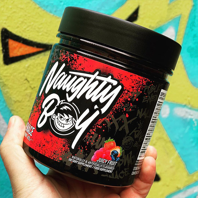
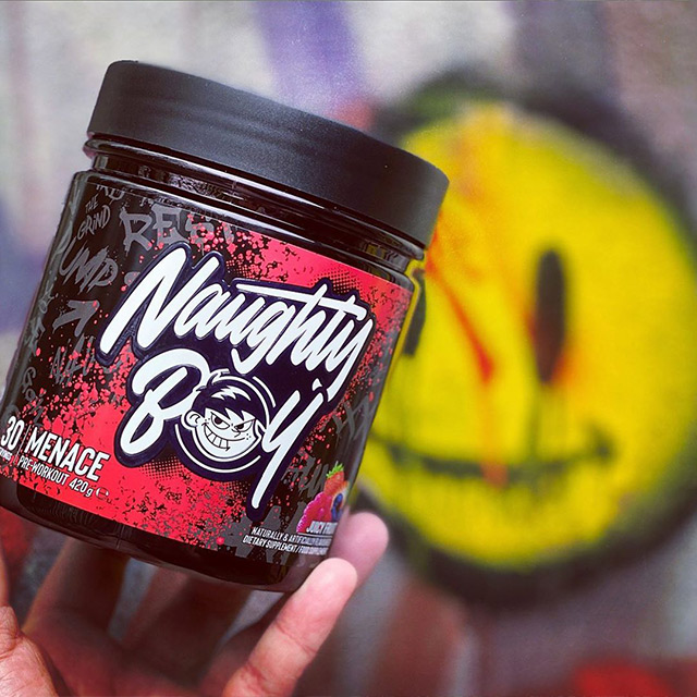
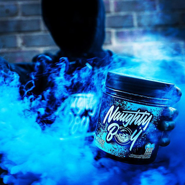
We approached our first set of packaging with the brand story in mind, wanting to capture the brand story within the design. Using a graffiti style with bold typography and contrasting colour, Menace captures the attitude of the brand while bringing something totally fresh to the sports supplement shelves. We wanted this tub to get noticed, and we’re proud to say we achieved our goal and more with Menace being a sell-out product almost immediately.
From there, we have made several designs with the same goal in mind. To push the boundaries and break the standard, clinical mould of supplement design.
