Sometimes, we’re all craving more positivity – especially from the simpler things in life. Mail Your Mark, a quirky gifts business, puts a smile on the face of your favourite people. With clothing, calendars and women’s accessories, it ties a neat string on presents packed with positivity.
The client came to us for a slick, comprehensive redesign for their ecommerce store. They wanted a much more minimal look, emphasising their product photos. So, we took this simplicity and ran with it.
Services
Approach
Mail Your Mark already had a store, a tone and a brand. But we sought to refine the best bits while extending the business’ identity in some areas – helping it say more with less, or going into more depth where it’s due.
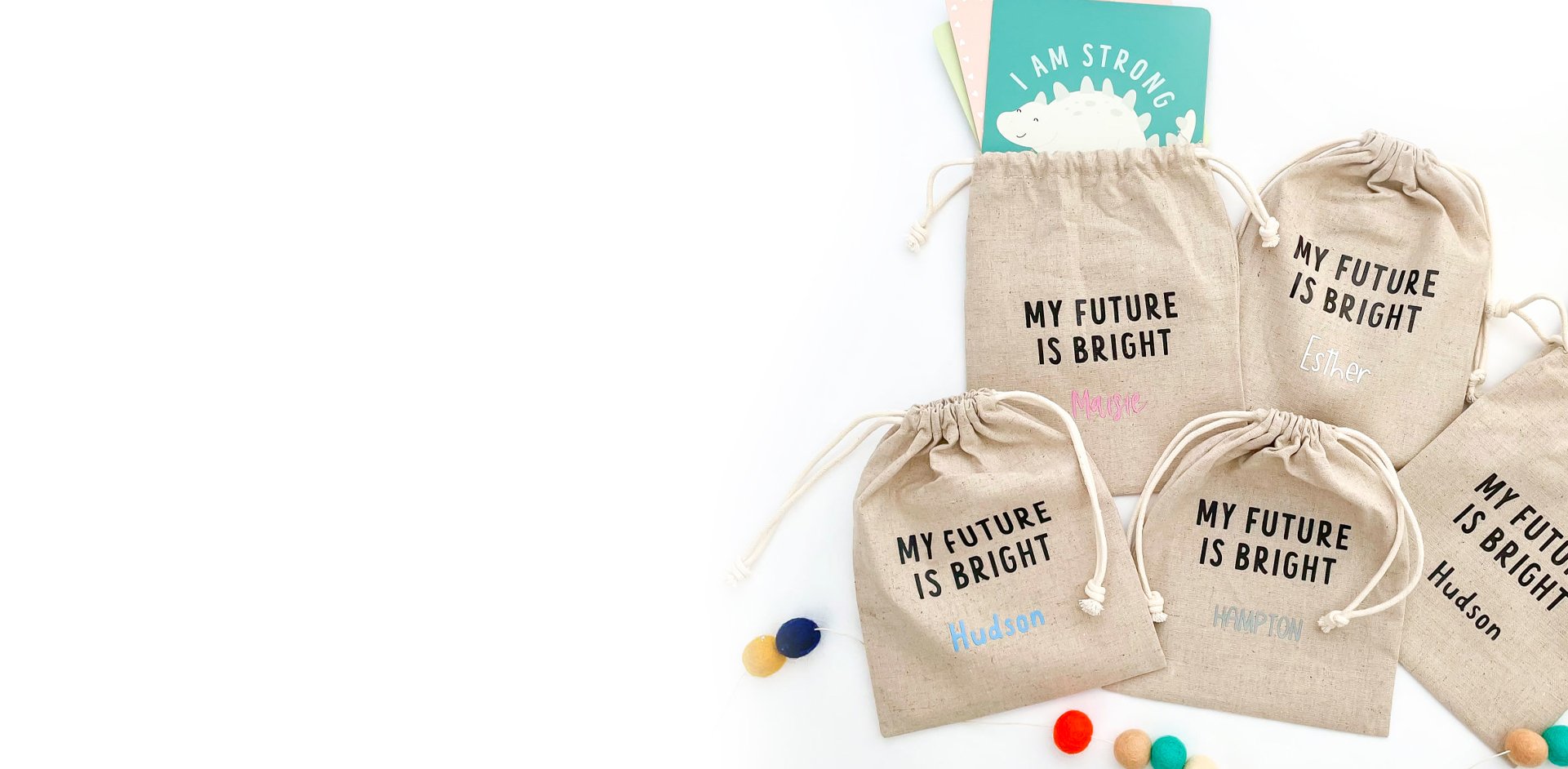
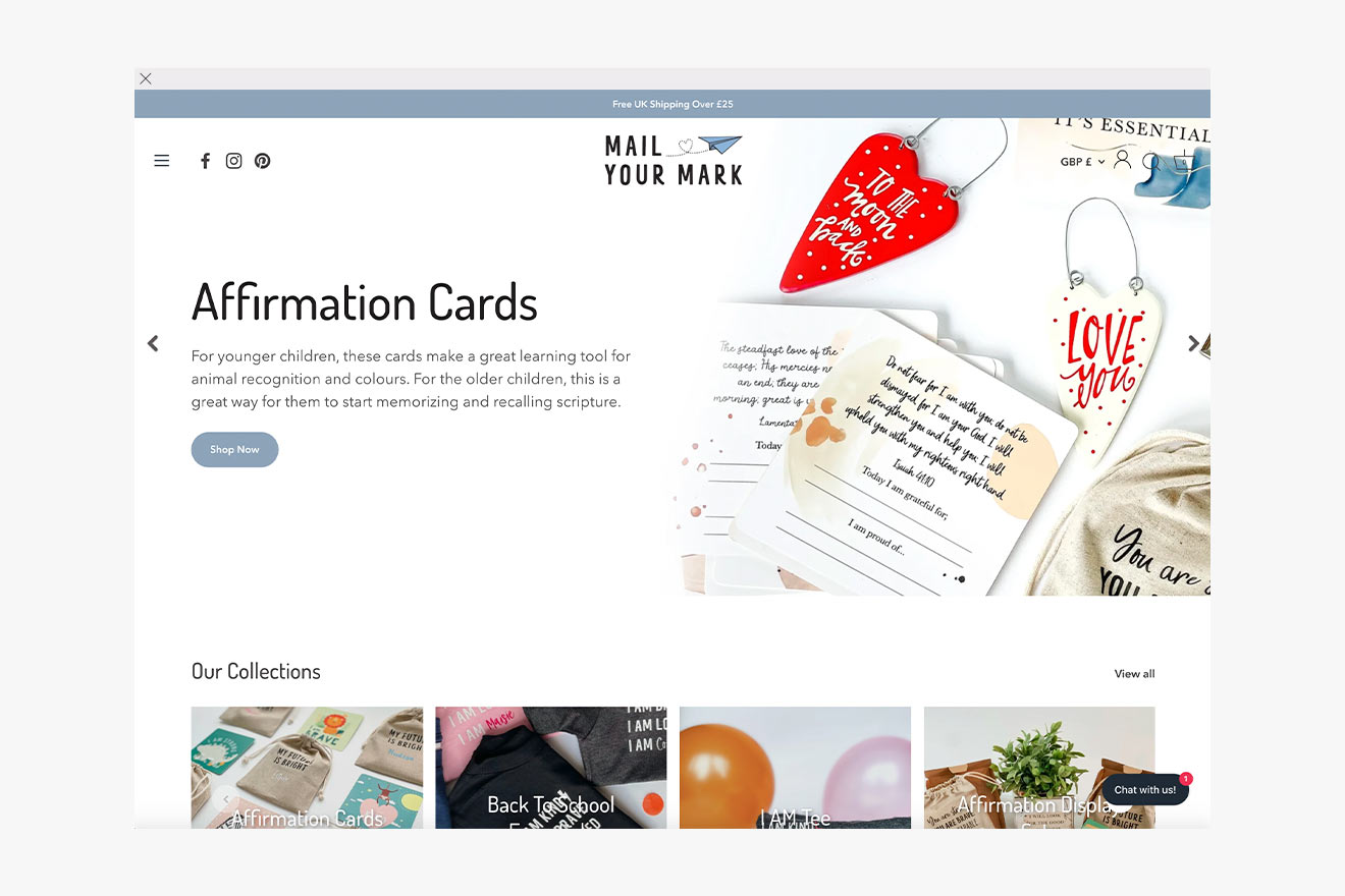
For starters, we chose an excellent theme, letting products sweep over a homepage gallery and link up for Collections. Text was chosen for the branding: playful, casual, like you’re getting superb advice from a friend.
The Create8 team applied pink and blue – essential colours here – very tastefully across the site. This meant going for pastel shades instead of anything too bright, melding around the photos instead of detracting from them. To round off the colour scheme, we adapted the logo too.
Meanwhile, we took the branding exercise further into Mail Your Mark’s blogs: lifestyle, wellness and family advice. These pieces would complement the store’s role in spreading joy. To keep eyes on the screen, we sharpened up the blog UI and added a topics filter.
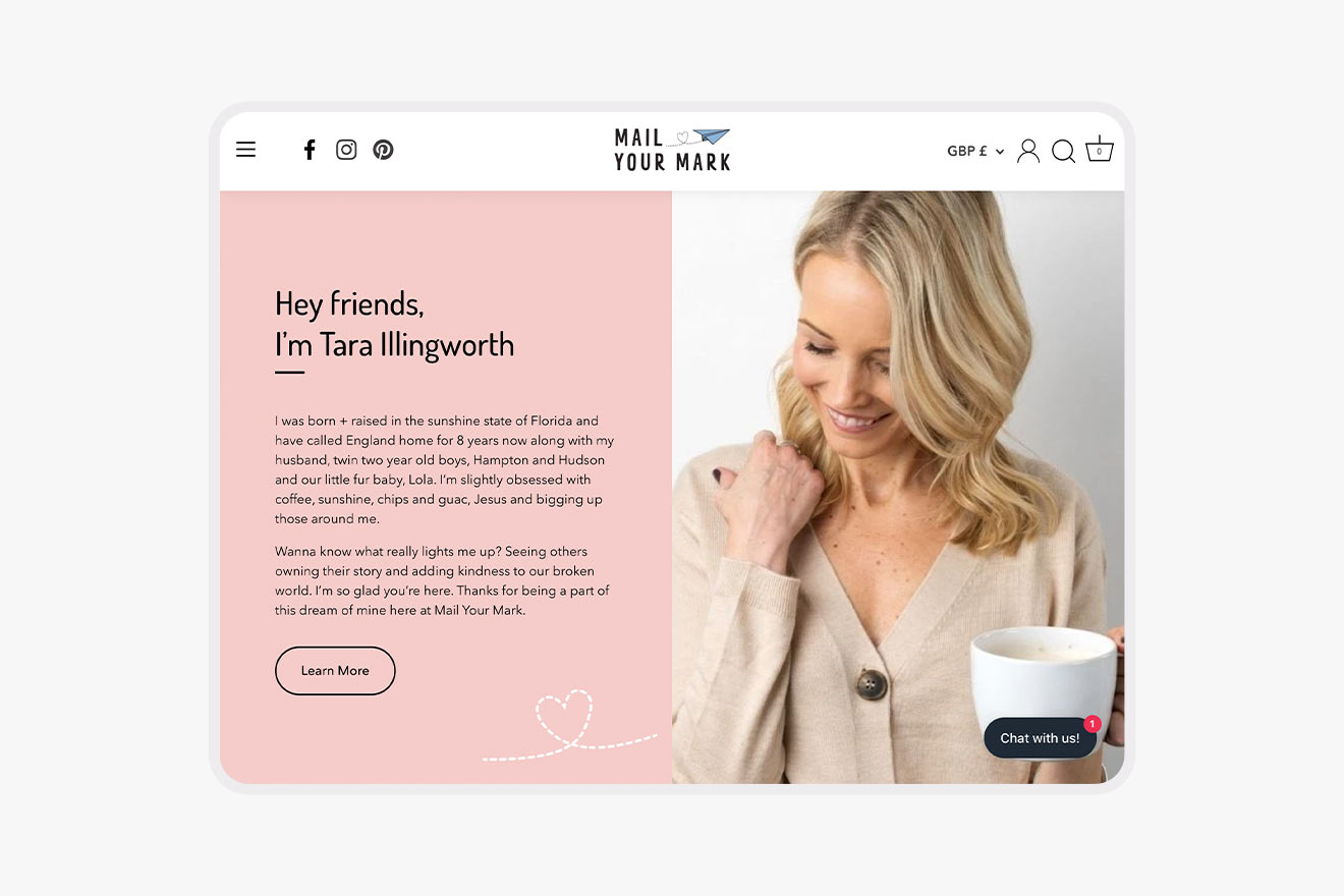
Then we moved onto the website. After testing several versions, we went with a light brown scheme on slices of white. Our Story and the homepage demanded large, soothing graphics that can hold someone’s gaze or give certified stamps for methods and ingredients. One at a time, we added them in.
Lastly, we looked at packaging. The science needed to be front and centre while appealing to a mass-market, social-savvy audience. Our packaging pros worked on bags for three coffees: Unwind, Focus and Protein. Finely drawn leaves accompanied these selections from each corner of the bag. They reference the coffee’s production, as well as the impression of a gym or health supplement.

Result
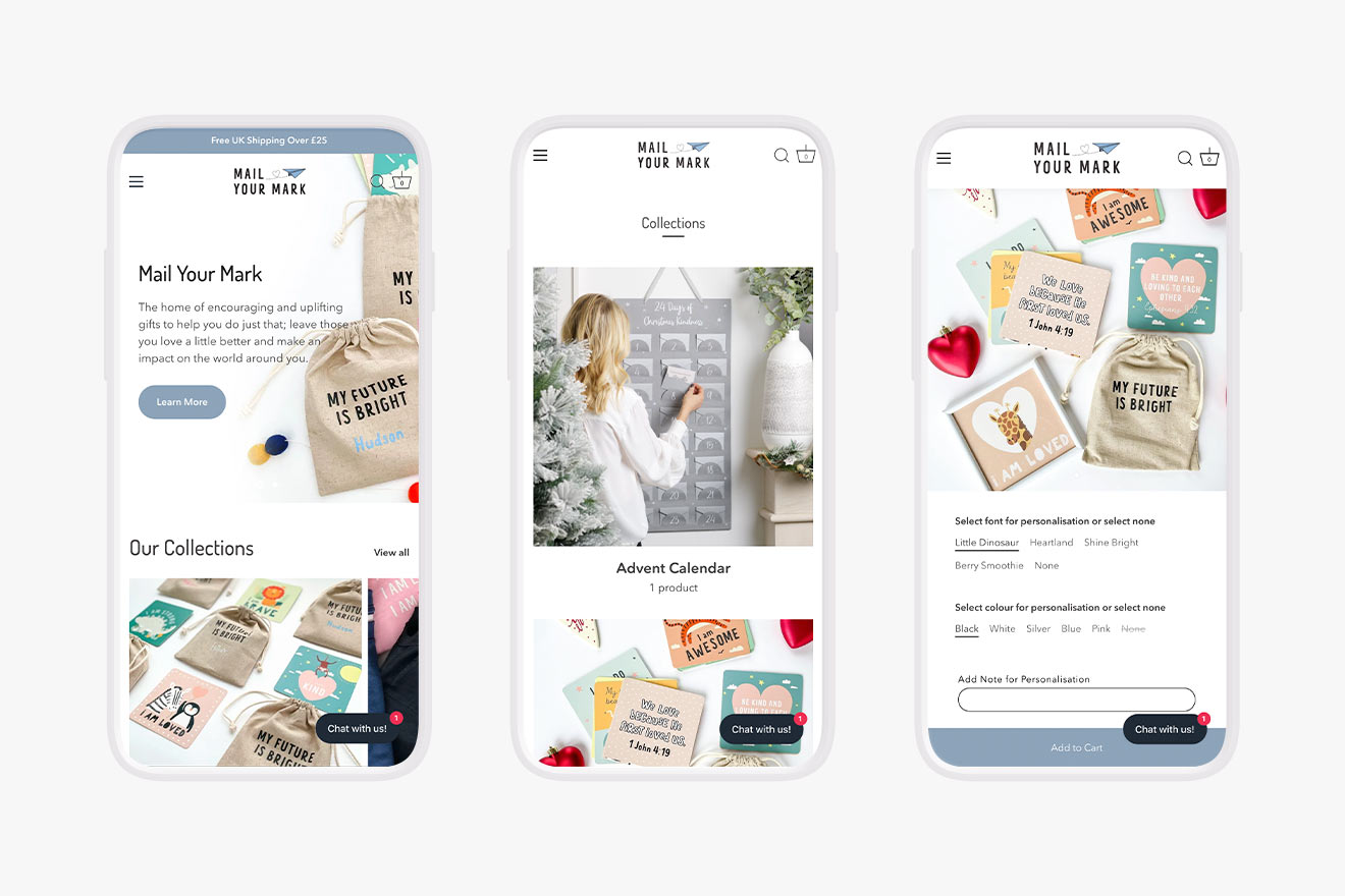
The website is so much cleaner. Hitting the homepage, you’ll see huge blocks of clickable imagery. The products are centrestage. Special segments highlight I AM t-shirts, seasonal campaigns and a live Instagram feed.
We optimised the site for mobile as well – large, prominent buttons lead users from one page to the next. For every product, there’s a range of personalisation options; no-one’s confused about what they’re buying or how it’ll turn out. Mail Your Mark has a beautiful platform to make its message felt far and wide.
”My experience with Create8 was fantastic. From their attention to detail to taking the time to run through any questions and concerns that I had. They truly delivered on making my new website both functional and also bringing my thoughts and ideas to life. 5 stars!
Tara Illy