Fonts are the visual voice of your brand, and making great font choices can help you create positive first impressions and build lasting connections with your audience. When done well, typography lets people know what your brand is all about, guides perception, and ensures accessibility.
Whether you’re starting fresh, or refining your brand identity, selecting the right font helps your company to tell its story – loud and clear – in a way that resonates with the right audience.
Looking for bespoke branding guidance? Explore how Create8’s branding process can help you define your brand’s identity, connect with your audience, and achieve all of your brand goals.
Why are fonts so important?
Font selection is central to brand design because it plays a key role in shaping how audiences perceive and connect with your business. But it’s not just about aesthetics – typography also reflects your brand’s essence, sending out visual cues that help communicate your identity and values. Ultimately, the fonts you choose establish your brand’s personality and create an immediate emotional connection with your audience.
More than just setting the tone, typography ensures consistency in your brand messaging and voice, which is essential for reinforcing recognition. A cohesive use of fonts across digital and print media fosters familiarity, helping your audience recall and trust your brand more easily. In fact, research shows that typography can boost brand recognition by as much as 80%, proving its importance as a design cornerstone.
Ultimately, thoughtful font selection transforms your brand’s voice into a visual language, giving your company a competitive edge in a crowded market.
How often should brands update their font choices?
Fonts that once felt fresh may begin to appear outdated as design trends shift, and this can potentially undermine your brand’s perceived relevance.
Like with everything when it comes to branding, you need to consider updating your chosen fonts to make sure they stay relevant and effective. It’s generally advisable for brands to revisit their font choices every 3–5 years (or whenever a rebrand is undertaken). This ensures your visual identity remains modern, cohesive, and reflective of your evolving brand narrative.
Staying competitive requires keeping an eye on industry trends. If competitors adopt bold, updated typography, it may signal the need for your own refresh to avoid falling behind. Similarly, advancements in technology and accessibility standards often necessitate adjustments. With new platforms emerging and accessibility guidelines evolving, your fonts must adapt to maintain clarity, legibility, and inclusivity across all touchpoints.
As your target demographic evolves, their design expectations may change, requiring fonts that better resonate with them. Conducting regular audits of your branding materials can help identify when a typography update is needed, ensuring your brand guidelines stay aligned with both industry practices and audience expectations while maintaining its unique identity.
The differences between serif, sans-serif, and script fonts
Typography plays a powerful role in shaping brand identity – each font style offers unique characteristics that suit different purposes and audiences. Understanding these distinctions ensures you select fonts that align perfectly with your brand’s personality and values.
Serif fonts
Recognisable by the small strokes (serifs) at the ends of letters, serif fonts convey professionalism, tradition, and reliability. They’re an excellent choice for brands seeking to establish authority or appeal to a more formal audience. Think of the classics, like Times New Roman or Baskerville, often used in industries like law, finance, or luxury goods.
Sans-serif fonts
Sans-serif fonts, defined by their clean and minimalist appearance, are ideal for modern, approachable, and digital-first brands. Typefaces like Helvetica and Open Sans are highly readable on screens, and work well for tech companies, startups, and contemporary brands.
Script fonts
Inspired by handwriting and calligraphy, script fonts bring elegance, creativity, and a personalised touch to a brand’s identity. Perfect for artisanal or boutique brands, typefaces like Pacifico or Brush Script add a sense of sophistication and individuality to logos or headlines.
Slab serif and geometric fonts
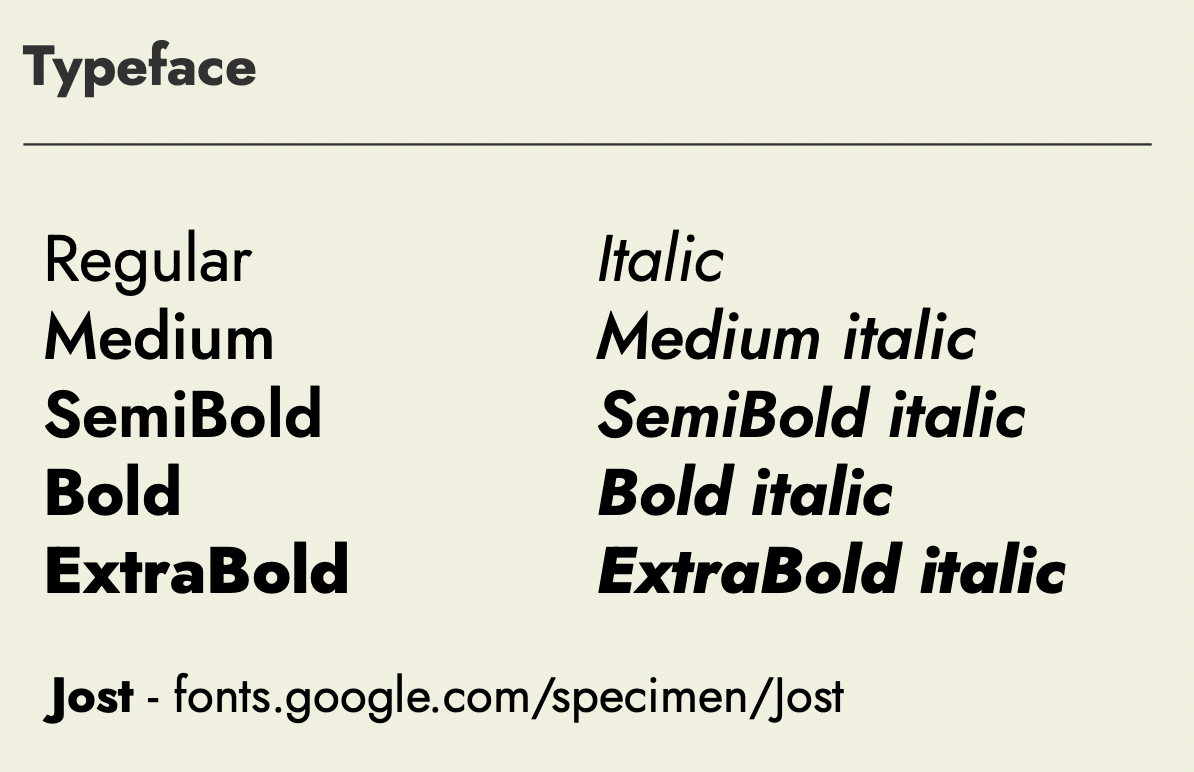
For brands wanting a bolder or more ‘vintage’ appeal, slab serif fonts like Rockwell create strong visual impact. Geometric sans-serif fonts, such as Futura, are ideal for more modern, minimalist brands, thanks to their symmetry and clarity.
Learning from the best: Examples of great font use in brand design
Your fonts should consistently reflect your brand identity, values, and audience expectations, so the obvious choice may not always be the right one for you.
Let’s look at some iconic examples – and what makes them so effective.
Apple’s minimalistic aesthetic is an obvious choice, centered around clean, readable sans serif typography. It works well for Apple, but it’s not the only successful approach to branding when it comes to choosing your fonts. Successful font choices aren’t just about aesthetics, so try not to just follow brand design trends.
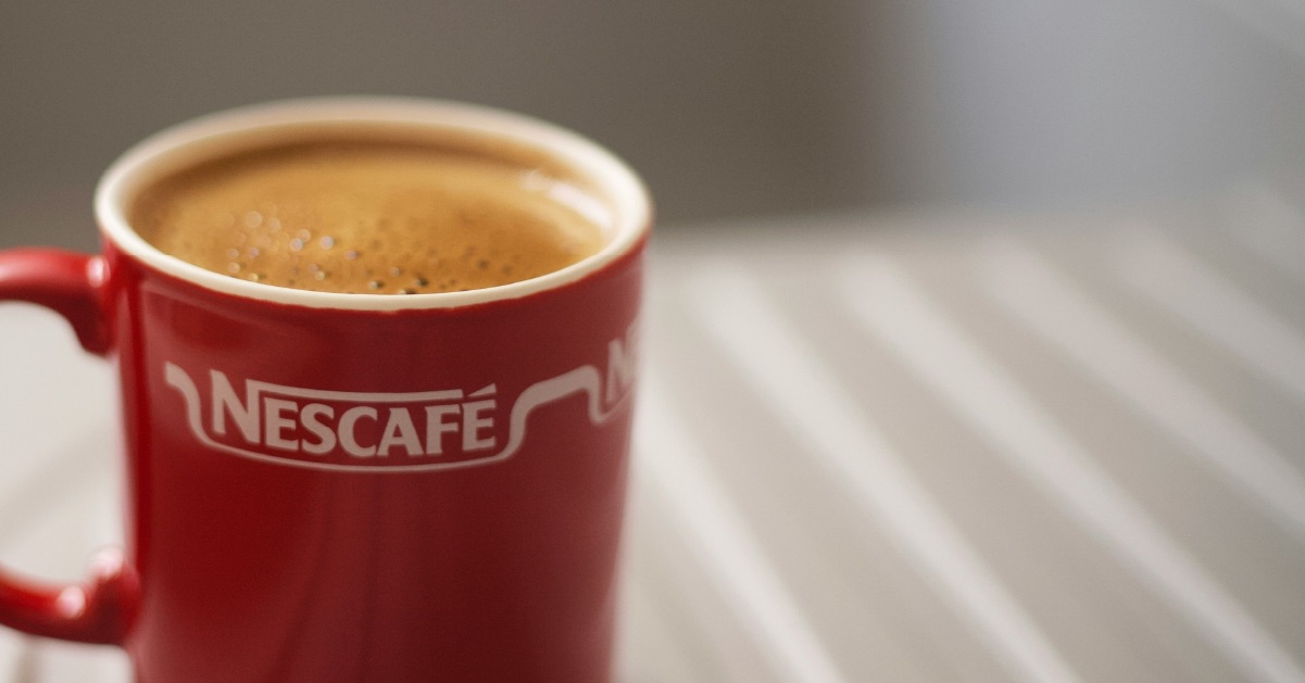
Coca-Cola’s iconic script font is a masterclass in timeless branding. Its flowing, elegant style reflects heritage, warmth, and emotional connection, helping the brand remain universally and instantly recognisable and beloved across generations.
Nike uses a selection of bold sans-serif fonts that epitomise simplicity and strength. The clean lines work seamlessly across platforms, from digital ads to product packaging, ensuring adaptability without losing the brand’s confident and energetic essence.
Google’s use of Product Sans and Google Sans strikes a perfect balance between playful and professional; and this has stayed consistently predictable over the years. Google’s geometric fonts enhance relatability while maintaining clarity and consistency across the brand’s diverse and always growing applications, from search results to marketing materials.
Key considerations when choosing fonts for your brand
Alignment with brand personality
Your chosen fonts should reflect your brand’s tone and personality. Playful fonts, such as handwritten or rounded typefaces, work well for creative and youthful brands, while serif fonts, like Times New Roman or Garamond, convey a sense of tradition and authority.
To address this, clearly define your company’s personality traits during the branding process, ensuring they evoke the right emotions and align with your message.
Versatility across platforms and mediums
A good font should perform well in both digital and print formats – so try to choose one that maintains its quality and impact across various mediums, from websites to business cards. Sans-serif fonts often work better on screens due to their clean, modern appearance, while serif fonts can add a touch of elegance to printed materials.
Your brand’s typefaces need to be versatile and readable, across all of your intended uses. You don’t need to find just one, but try to limit this to three fonts at the most.
Readability, legibility, and scalability
The readability of your brand’s fonts is critical – they should be clear and easy to read at any size. Prioritise typefaces with clean shapes, avoid overly decorative typefaces for body text, and ensure strong contrast with the background. And don’t forget scalability! The chosen fonts also need to look great and remain readable at any size.
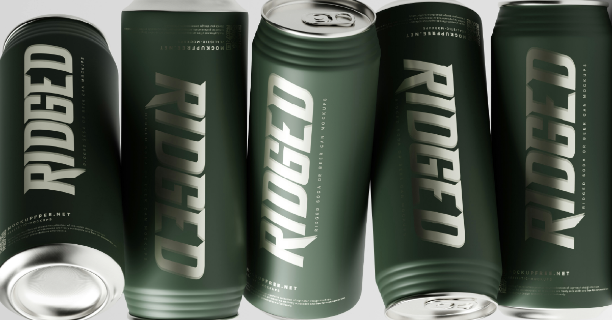
Test font legibility in real-world scenarios, such as mock-ups or prototypes, to help prevent usability issues.
Audience and cultural relevance
Your chosen fonts should resonate with your target audience and consider cultural sensitivities. For instance, a bold, modern font might appeal to Gen Z, while a more traditional typeface could better suit an older demographic.
Research your audience’s preferences and cultural context to ensure your fonts communicate effectively.
Before committing to a font, test it in real-world applications. Create mock-ups for websites, print materials, and social media to evaluate how the font performs. Adjust spacing, weight, and size as needed can help you to make sure it works seamlessly in all formats.
Common mistakes when selecting brand fonts (and how to avoid them!)
Because fonts are so central to effective branding, even a small misstep can undermine an otherwise great brand.
Overcomplicating choices:
Using too many fonts in your branding creates visual clutter and weakens your message.
Avoid this mistake by…
Limit your fonts to a maximum of three – a primary font for headings, a complementary font for body text, and a possible accent font for special uses like callouts. This will help you to maintain a consistent, professional look while adding enough variety for emphasis.
Ignoring accessibility:
Low contrast between text and background, or overly decorative fonts, can make content difficult to read, especially for users with visual impairments.
Avoid this mistake by…
Test your font choices using tools like the WebAIM Contrast Checker to ensure compliance with WCAG standards. Prioritise clear, distinguishable characters and sufficient text-background contrast.
Aesthetics over functionality:
Fonts that look stylish but are hard to read – especially in long text blocks – fail their primary purpose.
Avoid this mistake by…
Try holding a branding workshop with your creative team and stakeholders to make sure everything is cohesive and clear.
Disregarding platform compatibility:
Some fonts may appear inconsistently across devices or struggle with scaling on different platforms.
Avoid this mistake by…
Opt for web-safe and widely supported typefaces, such as those available through Google Fonts. Check how your chosen fonts render on both desktop and mobile devices.
Forgetting about brand consistency:
Inconsistent font usage across your brand assets confuses audiences and dilutes your identity.
Avoid this mistake by…
Create a clear set of brand guidelines and stick to them! This document should specify fonts for each use case (e.g., headings, body text, and digital vs. print applications).
Find fonts that work for your brand
Find out how Create8 can help you find fonts that speak volumes and build a cohesive brand identity that resonates with your audience and leaves a lasting impression. Get in touch to explain your requirements.